CyberSecurity — How 'Who' Edged the Feature
Pivoted an auditing feature into a real-time admin health dashboard by reframing who the actual user was.
CyberSecurity — How “Who” Edged the Feature
At the start of most design projects, defining who the user is seems obvious — but you’d be surprised.
In 2020, I joined Venafi to design the CodeSigning Protect product, with the excitement to design for another industry. While it had already launched to five customers and demonstrated market fit, there were gaps to address. One of those was the “Auditing Feature” — a documented requirement waiting to be designed.
The Beginning
I studied the document, had a few briefs with the PM and the Product/Tech Lead (a founding member who jokingly called himself the “product janitor”).
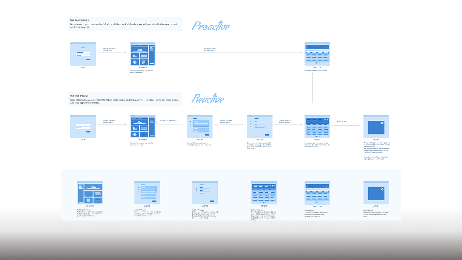
The ask was clear: enable auditors to discover the root cause of incidents — such as detecting if a signing key had been abused to sign malware. At the high level, we will need to provide contextual entry points and enable an efficient analytical flow when there is an outside trigger.
Dug In and Zoomed Out
I kicked off research during our (virtual) annual conference in 2020 — thanks to COVID, it was remote, but perfect for connecting (plus, screen-sharing and recording). I hopped into relevant “room chat” discussions and invited attendees to become early influencers for the newest product offering. That approach led to five enterprise customers, agreeing to interview. Our CodeSign customers were big enterprise companies and consultancy with high security needs, so I was very happy with the number of customers I was able to recruit.
The method was “Expert Interviews,” leading with open questions to understand their current practices, contexts, and motivations. Triggered by our conversations, we ended up zooming out beyond the feature.
Surprisingly, none had a defined code-signing audit process — even though they were pioneers in the space. In fact, their code-signing maturity was closer to infancy. I probed deeper into comparable auditing workflows in other cybersecurity practices, repeatedly asking “why” to uncover valuable insights.
Here’s the crux: Auditors — whether internal or external — are rarely using the product directly. Their reviews happen only annually, quarterly, or at best monthly. Instead of using the UI, they either sit with an administrator to navigate the system or simply request exported data.
Edge In Again
Clearly, auditing and incident diagnosis matter. But could we get more ROI by shifting the design focus? I proposed expanding the workflow to emphasize prevention, not just diagnosis. The full flow would include diagnostic tools, but daily health checks became the priority — same data, but now oriented toward **admins (the active product user) **for proactive use, rather than auditors (reactive use).
Beyond the key findings, other insights — derived from the answers to the “whys” (why he/she pay special attentions and took certain actions to keep their systems healthy) — helped position the feature as truly value-driven.
I advanced from low-fidelity to mid-fidelity mockups for both preventive and diagnostic scenarios. We honed in on a dashboard that offers admins:
- A real-time operational health summary
- One-click access to diagnostic workflows
Not surprisingly, engineering proceeded with the preventative dashboard first, delivering value to customers earlier — accelerating impact through preventative care.
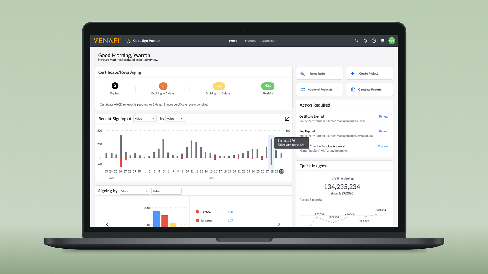
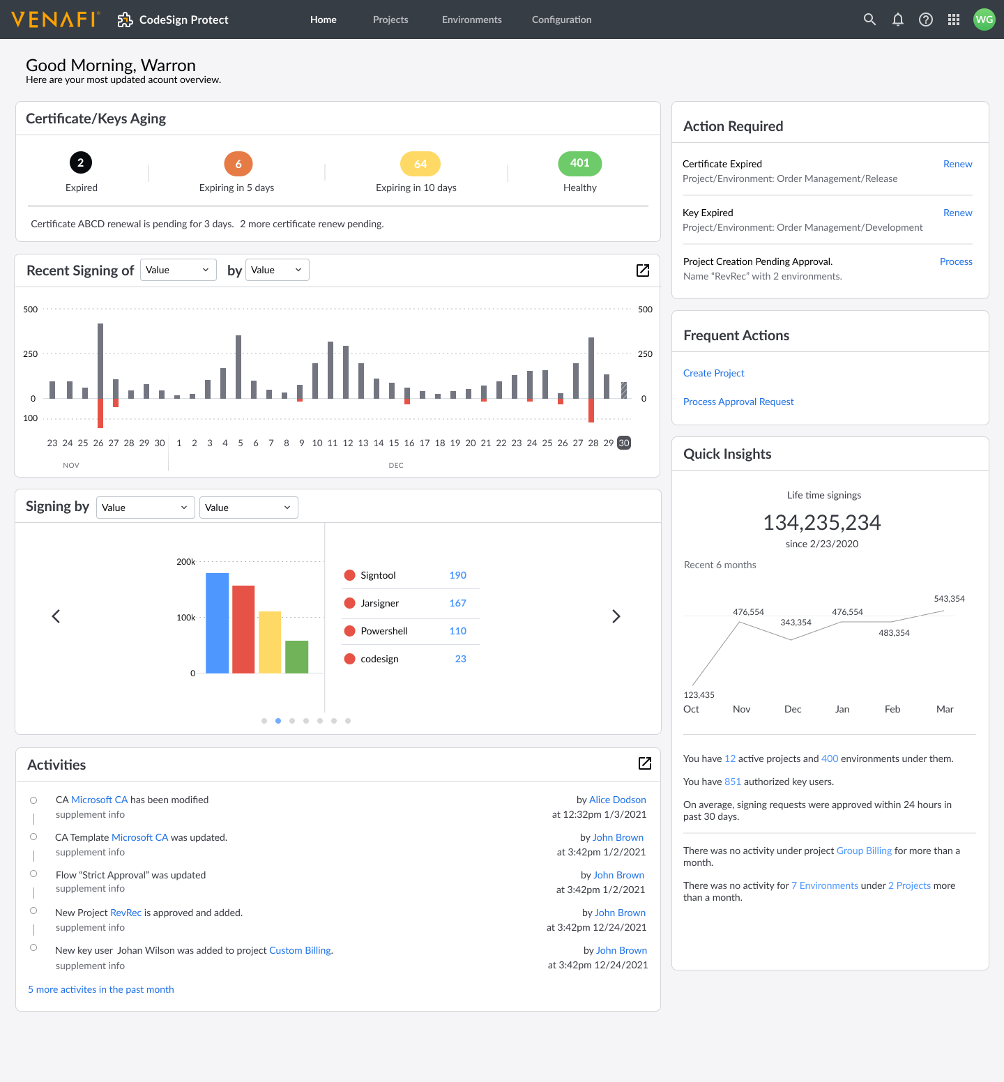 Homepage/Dashboard (not latest version)
The new homepage, which provides admins both a quick “health” summary based on real-time operational data and also quick entry point into any diagnostic workflow.
Through either a wizard to navigate the ambiguity or jump right in when the indicator is clear, you will be able to investigate each signing activity under a microscope here:
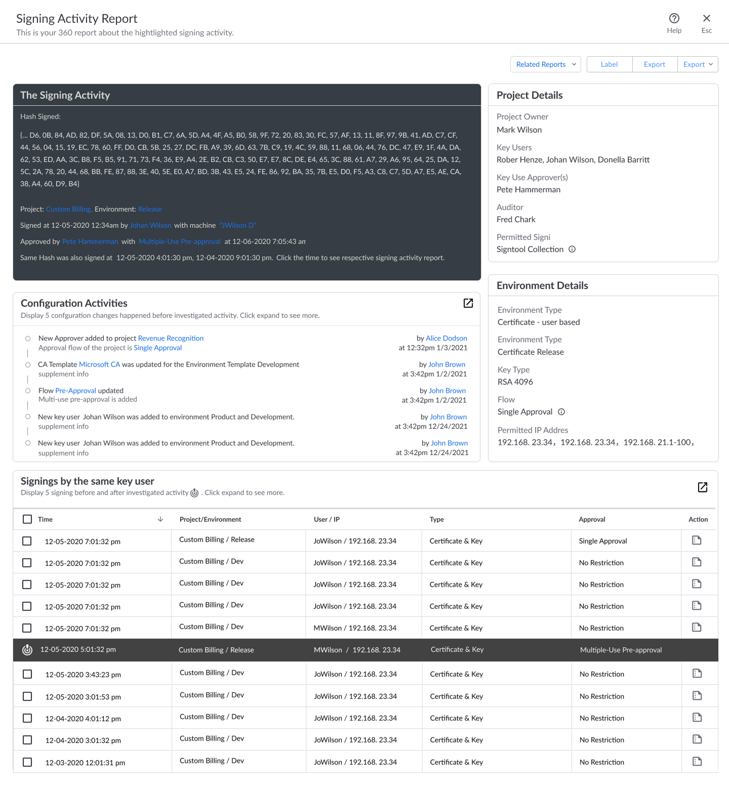 Signing Activity, under MicroScope
Reflection / Final Thoughts
If we had focused the design exclusively on auditors, the final experience might have been far less efficient for admins — the true daily users.
Of all the design questions — Who, What, How, Why — “Who” is the one we least often challenge. But as this case shows, re-examining who the primary user is can completely shift your direction.
The health-check dashboard was very well received — not just in immediate user testing but also through positive feedback months later from customer-facing teams.