IoT Simulator — refocus on action
Refocused an IoT simulator from data display to actionable decision-making for manufacturing operators.
IoT Simulator — refocus on action
“a problem well-stated is half-solved.” -Charles Kettering
IoT Simulator is a tool for simulating data message of IoT sensors. It creates a virtual IoT environment for developers to test their code when it is not feasible to develop with a real sensor network. IoT Simulator also enables QA, P&R specialist and Presales to generate sensors messages for test or demo purpose.
The team has worked on IoT Simulator for three months, a design was delivered to the engineering team. However, there is something wrong with it that make it hard to understand how to use. My task was to rethink the user experience.
STATE THE PROBLEM
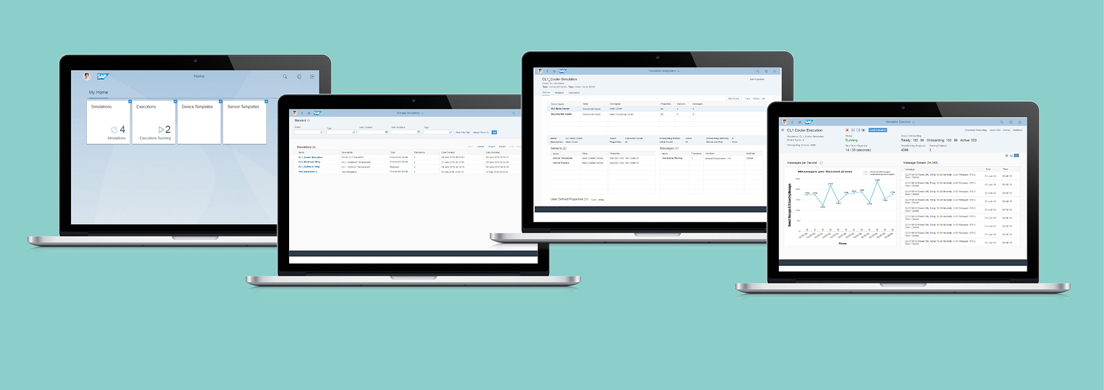
30 pages of product requirements and a dozen screenshots of previous design is what I have to get started. The three key tasks for the application is create “simulation”, configure “execution” and execute “execution”. The previous design has all the information onscreen and has screens for all the tasks, however screens didn’t flow. It takes me a while to sort out the relationship among the screens.
How to make the tasks flow?
Can I spin the question/problem from different angle? The questions could be:
Why does our user groups need to perform the tasks?
What are the relationship among the tasks?
Are users already familiar with the concept and terms?
Does the information on screen well support actions?
THE RE-SHAPE OPPORTUNITY
Went through the questions and then look at the previous screens been delivered. The problem gets clearer — Actions were put in a secondary position while information is surfaced as primary.
 Previous Design
While we worked on so many apps that are focus on data analytics in SAP, this one is not. It is for taking actions, with information to support — only the right amount of information at the right time. Redesign was smooth once the problem is well-stated. The stages of the tasks became very clear to me and mapped to my years of experience in designing for printing.
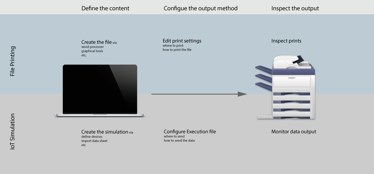 Understand the concept through a printing analogy
The opportunity for reshaping the experience start to unfold. Actions was put to the center of the new user experience, specifically I refocused the design to deliver clearer call to action; enable quick action based on history; provide sufficient and efficient information to support action and provide distinguishable visual for different stages of the action flow.
The key screens are simplified to three: one for enabling quick actions; one for creating simulations and configure executions and the last one for execute and monitor executions.
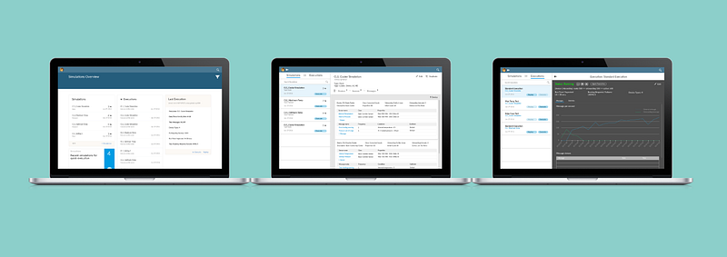 Three Key Screen of Redesign
The full redesign also include consideration for access right and relationship of different user groups, etc.
Contact me if you would like to know more.