Operational Efficiency Dashboard for Manufacturing
Co-innovated with Caterpillar to design operational efficiency dashboards for manufacturing workflows.
Operational Efficiency Dashboard for Manufacturing
The application is aiming to support Perfect Order Fulfillment in manufacturing, in co-innovation with a leading manufacturer of construction engines.
THE PROBLEM
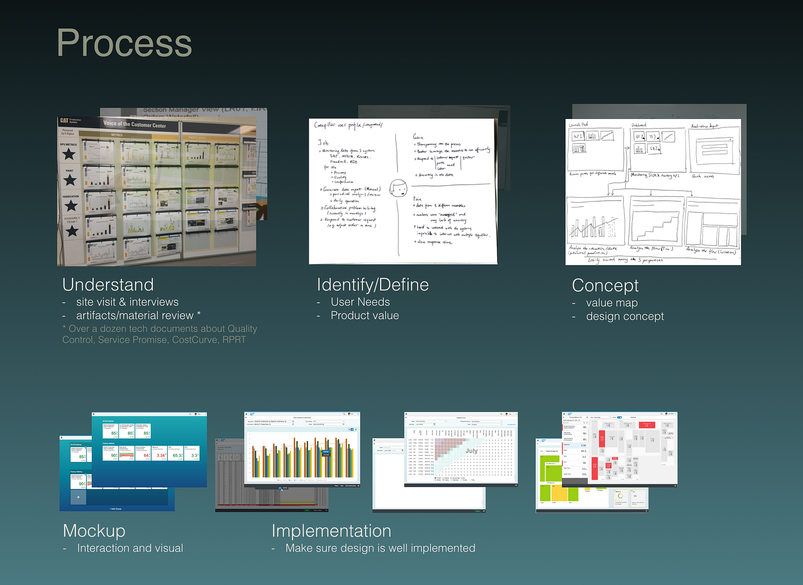
The construction engine giant was still running on papers — lots of papers. A two days workshop and dozens of technical documents — Excel sheets and PowerPoints, were given to help us understand the problem space and find the right target. A daily communication with customer was also kept throughout the project.
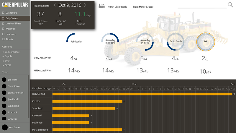
The final goal for this customer was Perfect Order Fulfillment. The Supply Chain Council describes perfect order fulfillment as a discrete measurement defined as the percentage of orders delivered to the right place, with the right product, at the right time, in the right condition, in the right package, in the right quantity, with the right documentation, to the right customer, with the correct invoice.
Within the phase we worked on, scope was limited to optimize the manufacturing operation.

THE SOLUTION
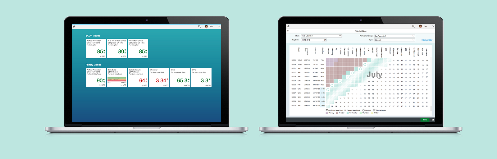
A Operational Efficiency Dashboard was designed and developed, targeting making the manufacturing process efficient and effective, including components for
- monitoring SCOR KPI;
- tracking orders throughout the manufacturing line;
- supporting flexible and efficient order scheduling.
Working in close collaboration with Customer operation team, we delivered the solution that led to a big sales deal and long-term collaboration.
EXPLORE THE INTERACTIONS
There are many interesting challenges in the interaction design part due to the large amount of KPI involve in the manufacturing process.
One example in designing the interaction is factory map configuration. Because it is a solution that is going to be carry out in several manufacturing plants globally, it is not practical and sustainable to pre-ship factory maps. The key configuration is to map spaces on a x by y matrix to the factory stations, sections, cost centers, etc.
The UI developer was told by PM to explore using drag-n-drop — drag from a long list of names to a dense matrix that reflect factory layout. However, through a quick Cognitive Walkthrough, I was sure it is not the right pattern to use. Because the visual scanning between the assigning list and the matrix and the map reference (be it a real map on paper) will interrupt the continuity of the flow, user will need to refocus onto the right spot of space every time then move their eye away and back. The solution I proposed which quickly approved by both engineering and PO is click-n-assign, through a in-place pop-up combo box. It not only significantly reduce users' cognitive load by letting them continue moving along the space/map, but also reduce the development efforts.

MY DESIGN PLAYGROUND
The design delivered above is based on SAP Fiori framework. I also had some fun to play with a concept freely, which focused on a view we scoped out for the business delivery — daily view.