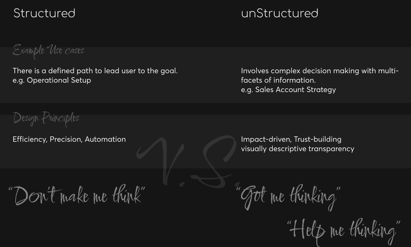
Design for billing, the structured and unstructured use cases
Defined the UX framework for billing — when to minimize cognitive load vs. when to maximize decision support.
Design for billing, the structured and unstructured use cases
The Context
Apttus was positioned as a Quote-to-Cash Company with 3 product pillars, Quoting, Contracting and Finance. While I was there, owning the UX for the finance pillar (including order management, billing and revenue recognition), 70-80% of my time was spent on billing.
The main initiative of Billing was to design the billing product for Apttus cloud. At the time, the billing product of Apttus had over 500 existing customers in 18 industry verticals, for the Salesforce version. The goal was not only to bring the new cloud solution to feature parity with the Salesforce version, but also bring the UX to next level, free from the limitations of the Salesforce UI.
The Billing Use Cases
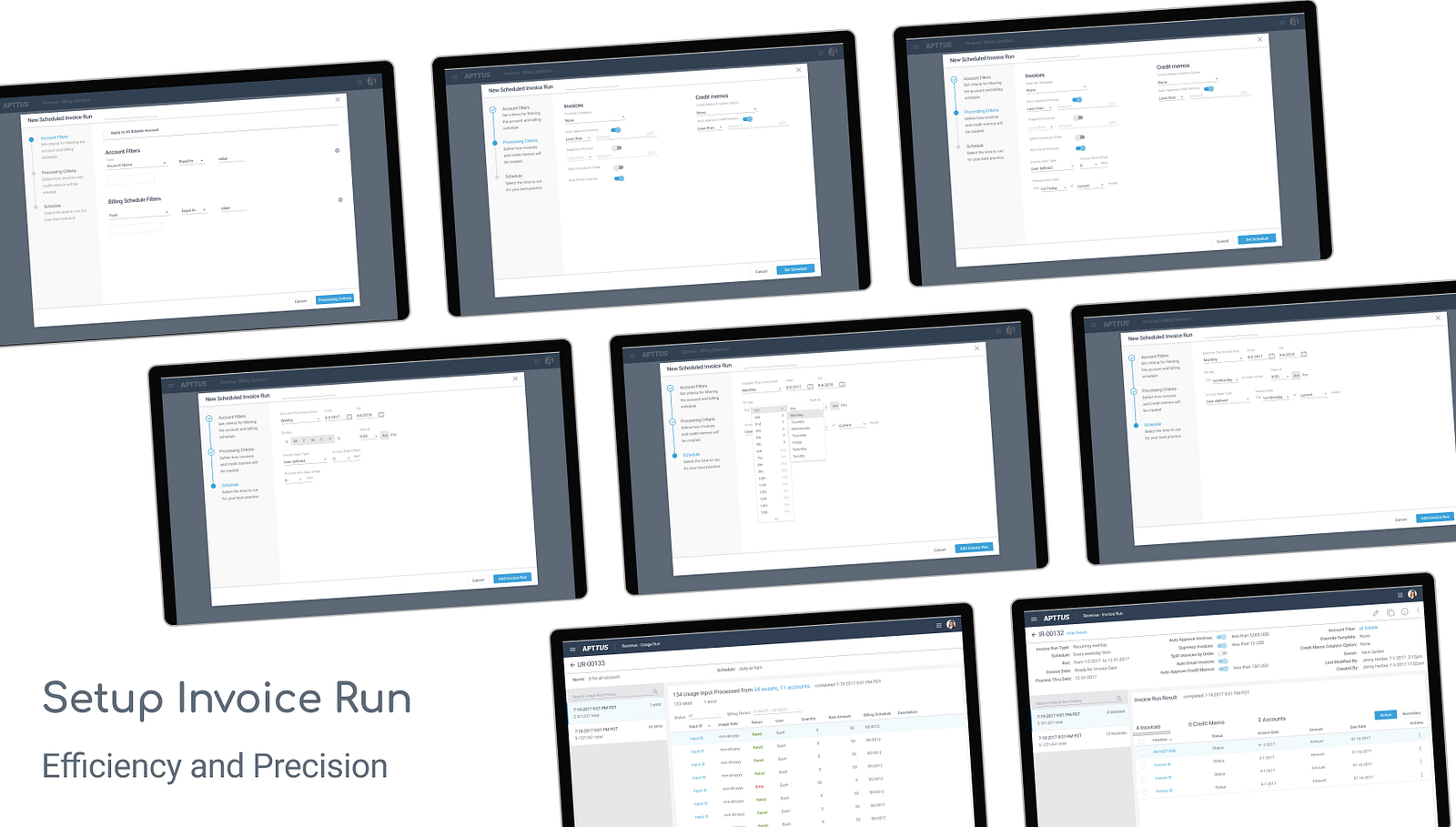
There were a big list of use cases, a large portion of which were presented in the format of “wizard”, due to the high volume and highly repetitive nature of billing activities. The setups are highly structured to handle the “automatable” and leave human for the “tough cases”. Example features are set up for invoice run, usage run, billing plan, billing term, etc.
An one phrase principle for designing this category would be, as the title of the renown UX classics, “Don’t Make Me Think”.
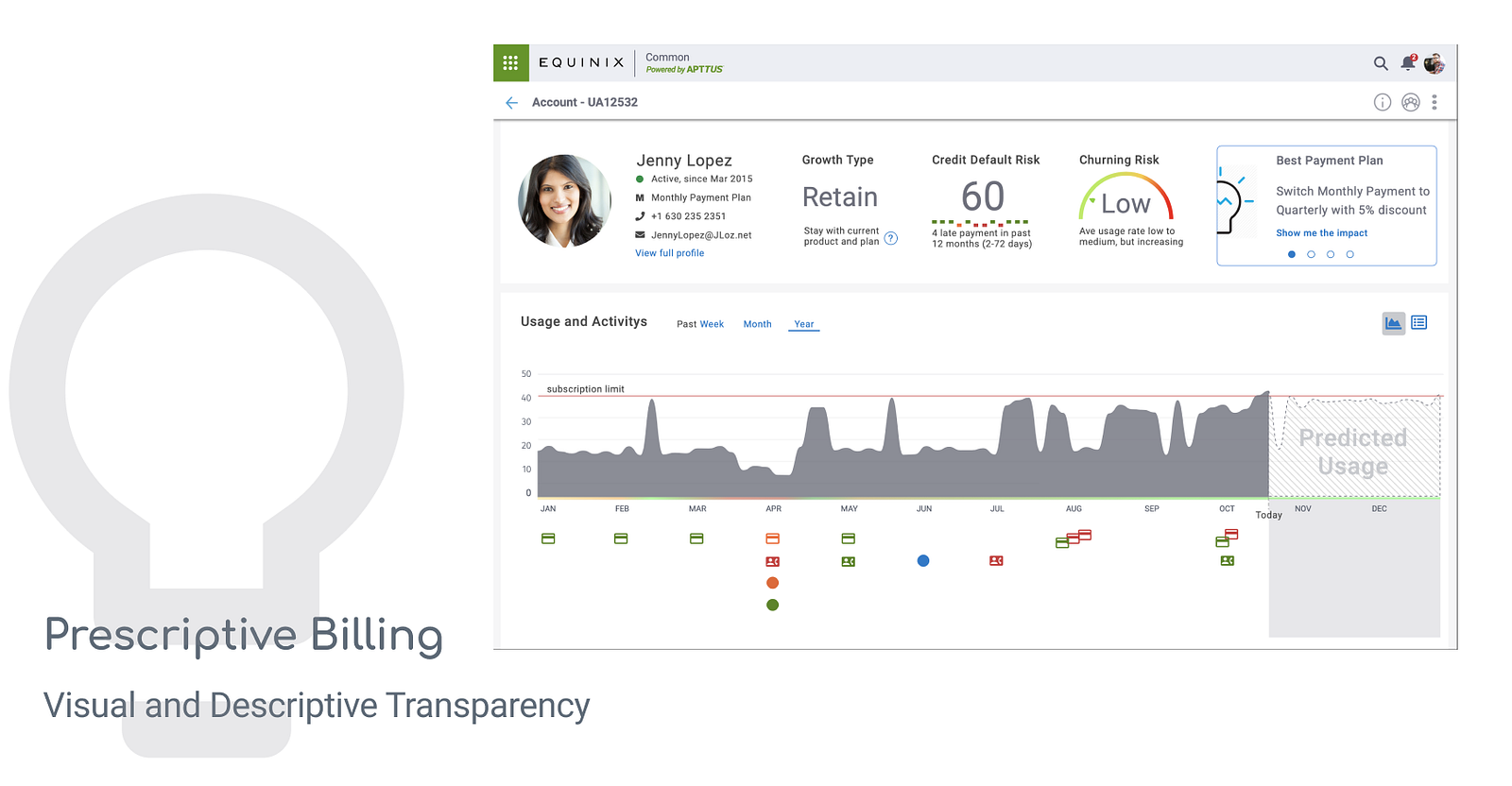
The rest, I’d like to call them unstructured use cases, e.g. landing page, object page, forecast, analytical page, etc. A good example is the “Prescriptive Billing” account page, which provided layers of information for initiating/making informed actions. In this case, there is a prescribed action, however we still put the control and transparency to the user’s hand.
An one phrase principle for designing this category would be “Got Me Thinking” , providing conversation start points, thought stream stimuli or potential actions.
There are many ways to approach a design problem, While working on this big overhaul I started to really think the way to discuss in this writing — is it structured or unstructured. Below is a quick chart of the approach, to be followed by two specific billing use cases.
Design for the Structured
The Apttus Billing on Salesforce UI was relatively mature with a big customer base. It provided a great reference point for WHAT to be designed. At the same time, luckily, we were not constrained to the **HOW **(user will experience it).
To Understand
The design decisions are supported by four main pillars.
- Study existing product (Salesforce) — systematically understand what’s there and how well they are used
- Finance and billing focused training — systematically understand the operational context
- Competitive products — fractured information, hard to understand underlying logic but great thought stimuli
- Don’t forget the Human, on going user research with internal/external billing team through out the process — understand the underlying logic, the tips and trick and the real pain
Side notes on research with internal team. It was considered as less ideal to start with, but turned out to be a fortune to have. I recruited two of our own billing specialists (AR and AP) to participant throughout the design process. We had multiple sessions of interviews and I was able to look deep and broad into their working context. I was able to looking into things like their secrete excel formula, real purchase orders/invoices and chat over the “difficult accounts”. With external users, the conversation is hard to go as deep and the artifacts are almost impossible to collect (sensitive data).
To Design
Taking the invoice run setup as an example. There is two layers of designing, after a thorough understanding of the needs. 1) decide on the interaction paradigm, wizard in this case, and structure (key decision making steps or “independent” logic blocks); 2) input needs and interaction/communication strategy.
Design for the unStructured
“Don’t make me think” set the premise of what a good software (or interaction) should behave and widely accepted. It is the touchstone for a cognitive walkthrough before you even dare to take users’ time for testing.
However, after years of design for operation and get into supporting complex business decision making. I wondered: is design really meant to keep users from thinking and wondering and pondering, or is design even capable to do that. Maze-solving is fun. Business operations has a large “streamlinable” part and also opportunities to experience a multi-in multi-out maze with unique decision makings and “tokens” to collect along the way before finding the exit.
To Understand
The keys to understand for an informed “maze” navigation are 1) where should we leave an exit open, 2) where to shine a light when needed. In another word, we need to understand 1) the potential decisions that the user may reach within this context and 2) what are the information that can lead to or support the decision at the specific context and timing.
To Design
To design for this category, I believe the best way is to
First, design the layout depends on the decisions that the visual communication/ design may lead to, based on impact-driven ranking of the decisions. Follow that, lay the information out into the layout blocks by the first step. Key information or “prescription” (if available) first, then fit in the supporting information with goal to further ground the potential decision building user confidence in the potential decision.
In practice, I feel design for the unstructured user case requires deeper understanding of the underlying logic of user’s “think”, “feel” and “gain”, while design for structured use cases focus more on the understanding of “say”, “do” and “pain” in a classic Empathy Map.